Tuque Insurance App
Involvement
Lead UX/UI Designer
About
Tuque Inc. provides enterprise software solutions for personal and commercial insurance serving the insurance sectors in Canada.
About
Tuque Inc. provides enterprise software solutions for personal and commercial insurance serving the insurance sectors in Canada.
Objective
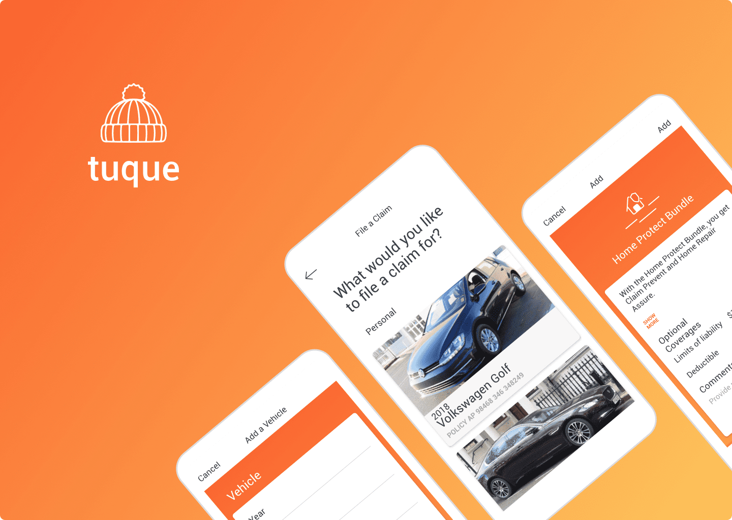
There's a new insurance company on the scene that's shaking things up and preparing to launch an MVP app. This company understands that the traditional insurance model can be slow and frustrating for customers, and they're looking to change that. By leveraging the latest technology, this insurance company aims to simplify the insurance experience and make it more accessible for everyone. Their MVP app will offer customers a seamless way to manage their policies, file claims, and connect with support when they need it. With this disruptive approach, the company hopes to attract a new generation of customers who demand transparency, convenience, and a personalized experience.
Discovery
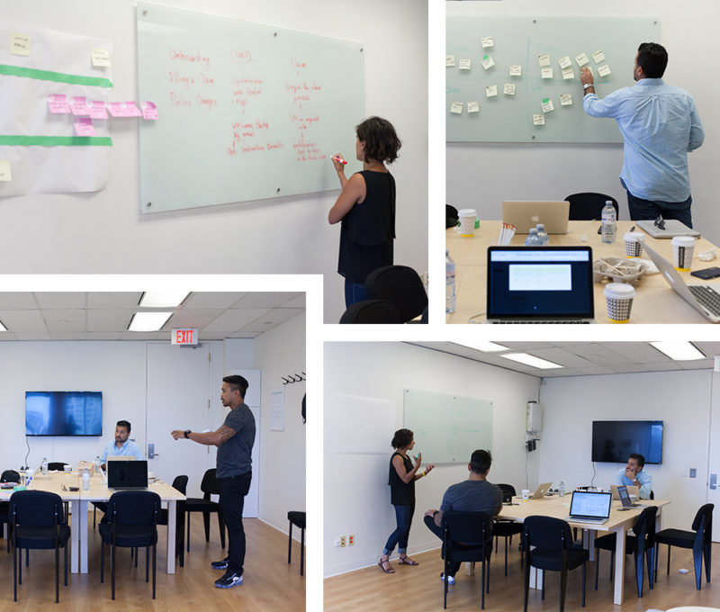
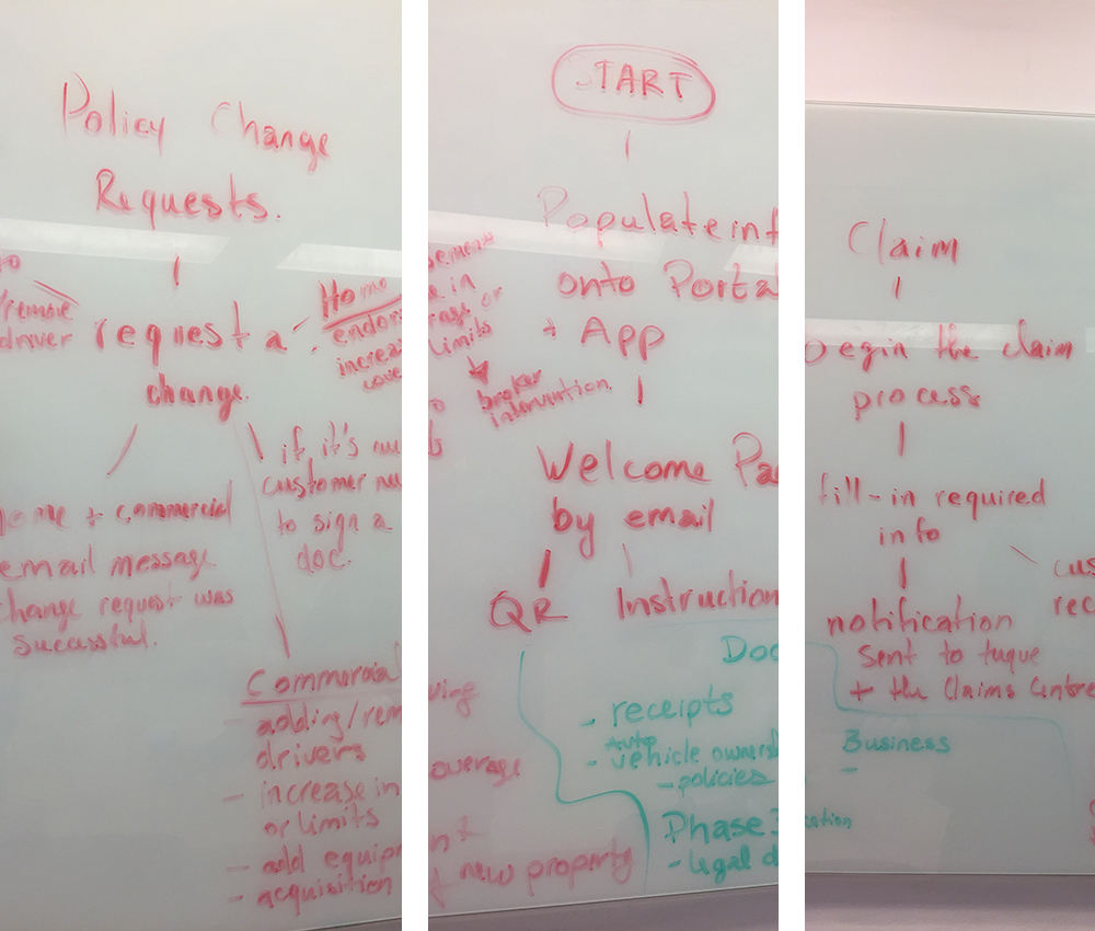
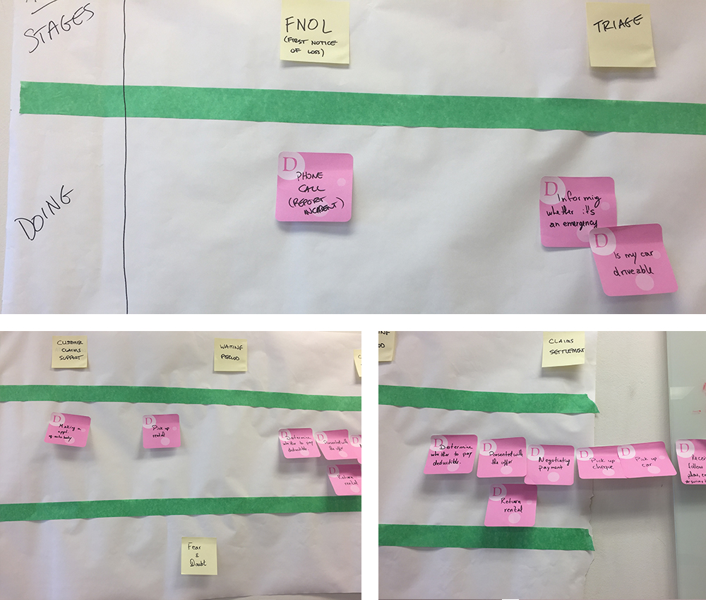
Initiated this project by engaging with the primary stakeholders in having our first workshop. Our goal was to have this discovery process unravel and get to the core of the business goals and objectives. Below is a rough outline of what we sought to achieve over two day workshops.
Discovery
Initiated this project by engaging with the primary stakeholders in having our first workshop. Our goal was to have this discovery process unravel and get to the core of the business goals and objectives. Below is a rough outline of what we sought to achieve over two day workshops.
Discovery
Initiated this project by engaging with the primary stakeholders in having our first workshop. Our goal was to have this discovery process unravel and get to the core of the business goals and objectives. Below is a rough outline of what we sought to achieve over two day workshops.
Discovery
Initiated this project by engaging with the primary stakeholders in having our first workshop. Our goal was to have this discovery process unravel and get to the core of the business goals and objectives. Below is a rough outline of what we sought to achieve over two day workshops.

Workshop agenda.
User Journey
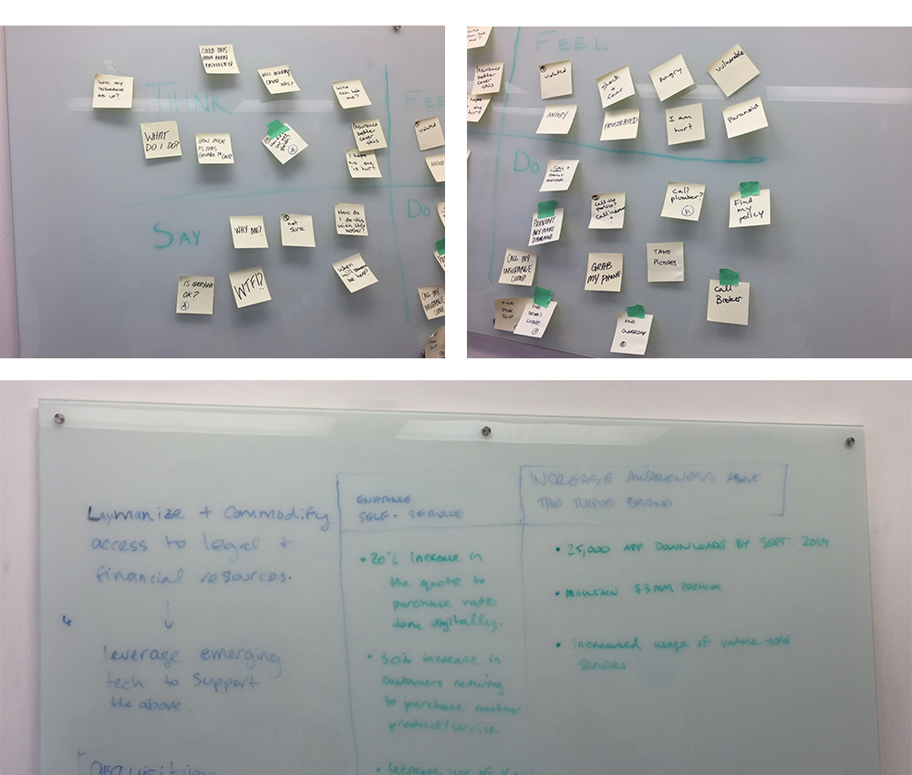
Empathy Mapping
Synthesize Info
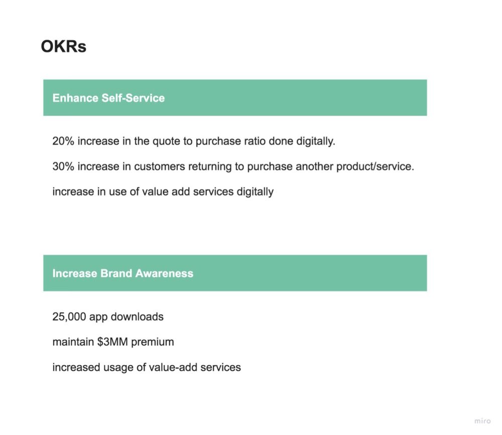
Once we gathered all the information from the main stakeholders we began to distill all the data and quickly organized and broke down the main takeaways, adding them to our Miro board. Stakeholders were then able to go in and make comments, edit and ask any questions.
Synthesize Info
Once we gathered all the information from the main stakeholders we began to distill all the data and quickly organized and broke down the main takeaways, adding them to our Miro board. Stakeholders were then able to go in and make comments, edit and ask any questions.
Shorthand UI
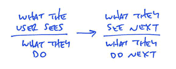
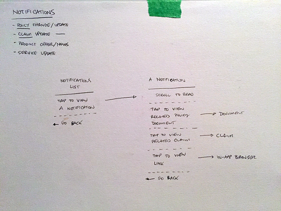
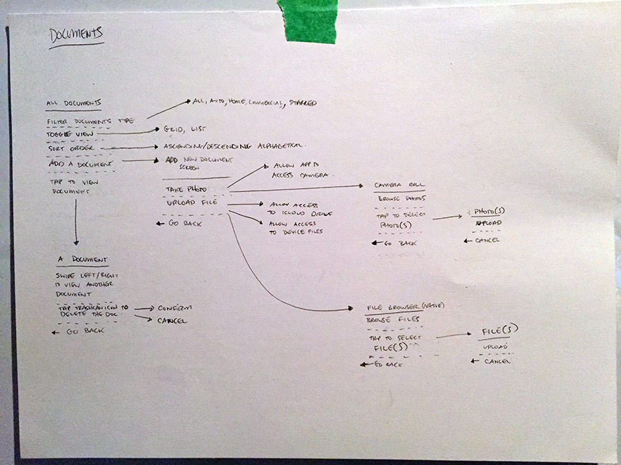
Flows are hard to communicate during the design process and drawing out every state of a flow is too time-consuming. We decided to approach this with a format that's really fast to sketch, and it communicates the essentials of what needs to happen. This is a two-sided nature with a bar, above the bar is what the user sees, and below the bar is what they do. An arrow connects the user’s action to a new screen with yet another action.
Wireflows
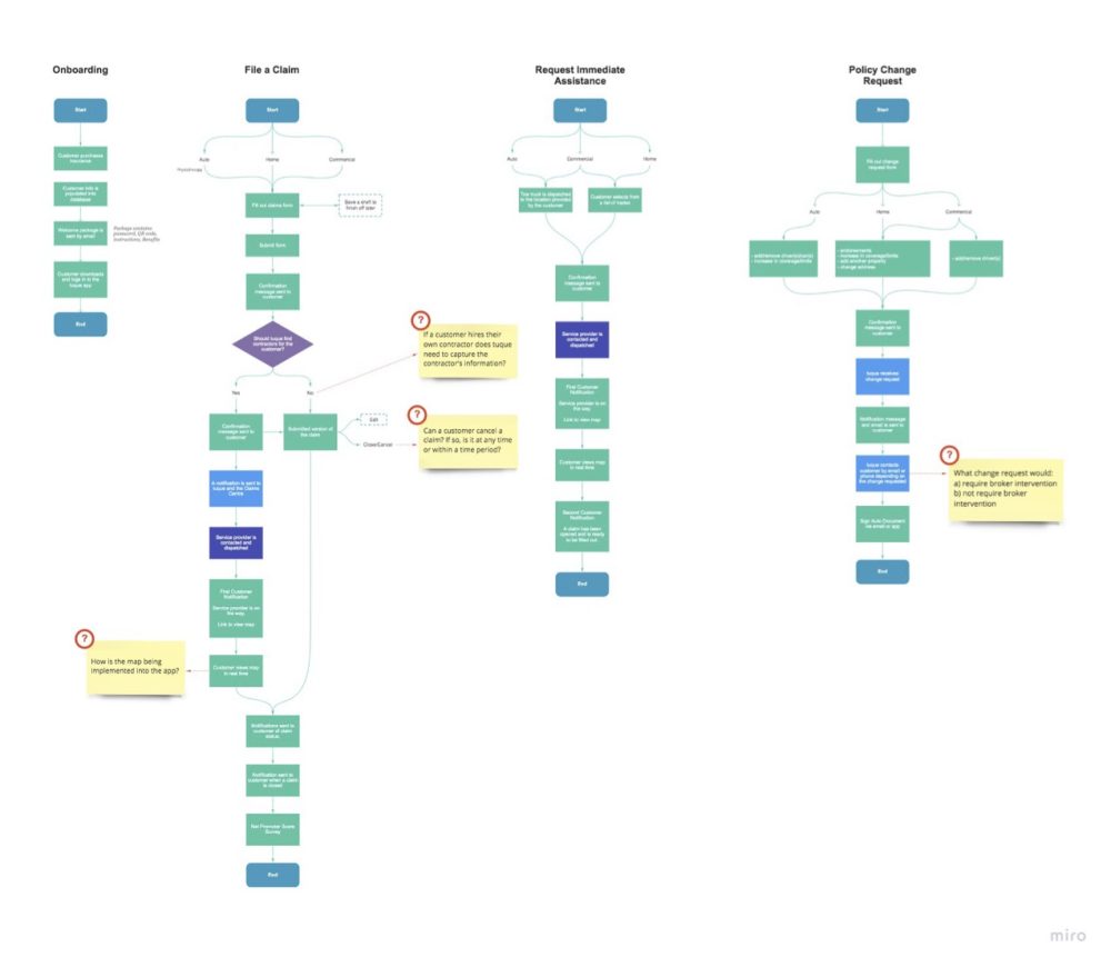
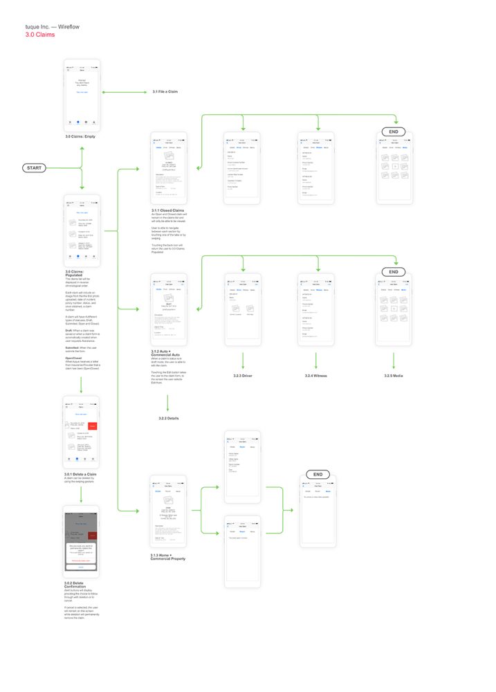
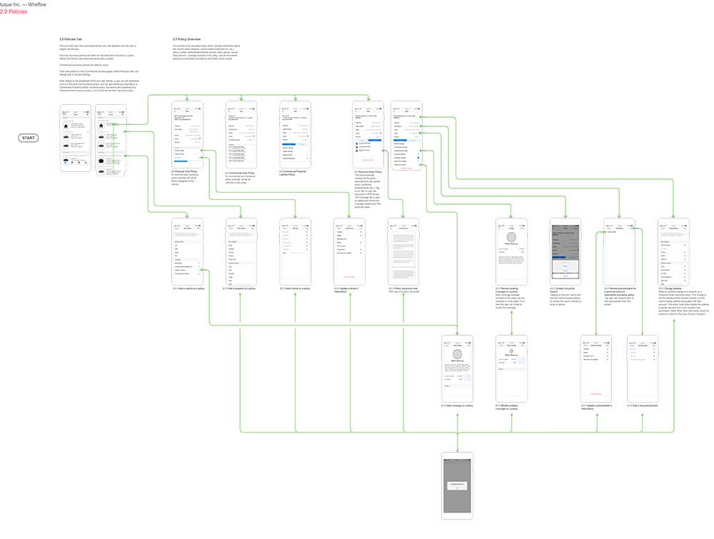
Moving on to wireflows we began to tackle each one separately as there were multiple to cover, from filing a claim to managing every document being held in the app, to notifications. Below are a couple of flows to show the thinking behind the system and user behavior.
Wireflows
Moving on to wireflows we began to tackle each one separately as there were multiple to cover, from filing a claim to managing every document being held in the app, to notifications. Below are a couple of flows to show the thinking behind the system and user behavior.
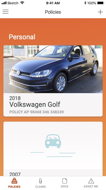
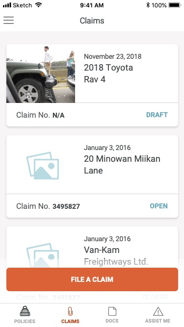
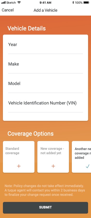
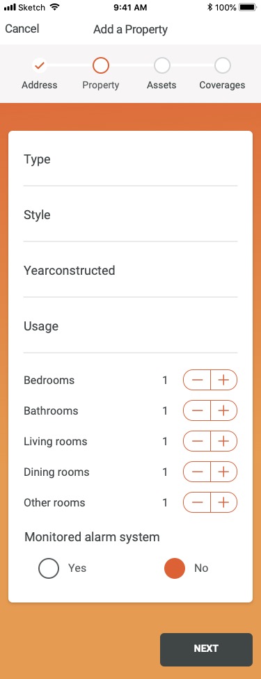
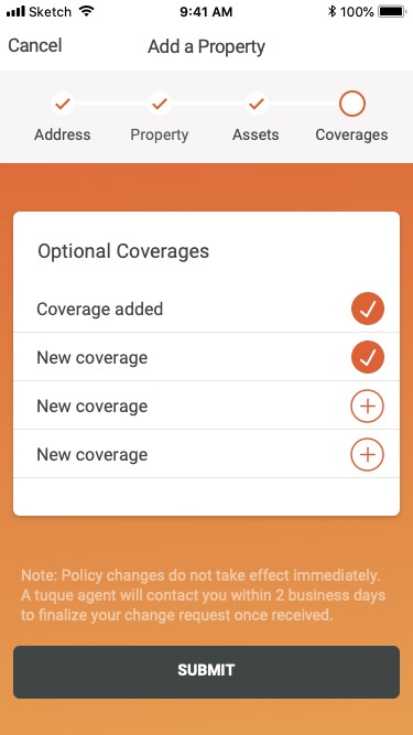
Mockups
Mockups

Continue Exploring
Masters of Scale Courses AppEducation
Boundless RiderInsurtech
CoFo DesigneCommerce
Sweet Reason - DrafteCommerce

Pathways to EducationSocial Organization