Educational App
Masters of Scale Courses App
Masters of Scale Courses App
Masters of Scale Courses
Masters of Scale Courses App
Masters of Scale Courses App
ROLE
Sole Product Designer
TEAM
Product Manager
2 Developers
QA Analyst
Challenge
There is little emotional benefit communicated through the current buy-flow, and little messaging about why one travel insurance is different from its competitors. Current travel insurance purchase sites are transaction oriented, and are functionally undifferentiated from one another.
About
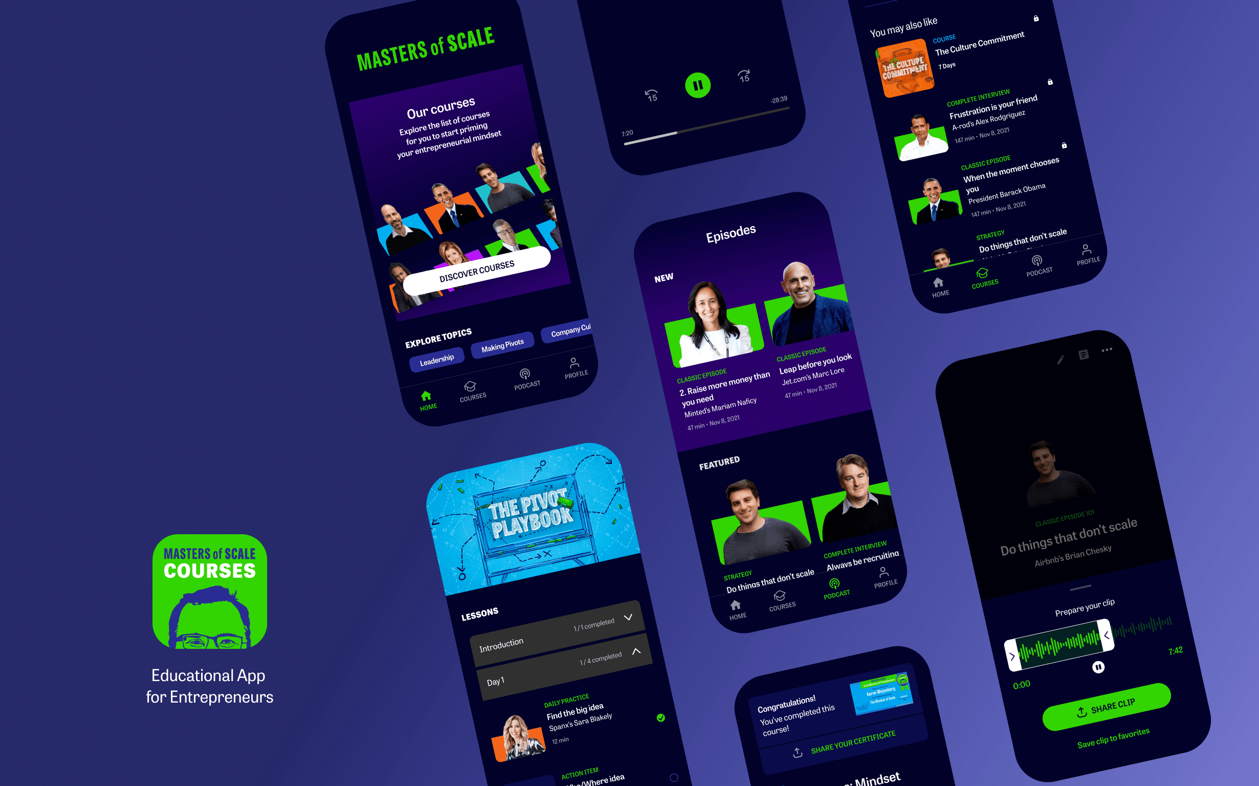
The Masters of Scale Courses app is a highly curated learning experience designed to cultivate the entrepreneurial mindset for leaders at any level, and at any stage in their company’s growth.
For its MVP, Masters of Scale sought to create and build a product for its podcast listeners that focused on a sophisticated learning experience. Offering premium content by distilling key insights centered around a 10 minute daily practice where entrepreneurs can then apply to their business.
About
The Masters of Scale Courses App is a curated learning experience designed to cultivate the entrepreneurial mindset for leaders at any level, and at any stage in their company’s growth. It centers around a 10 minute daily practice, where key insights are extracted from interviews with iconic business leaders who share lessons and strategies, for entrepreneurs to then apply to their business.
Challenge
There is little emotional benefit communicated through the current buy-flow, and little messaging about why one travel insurance is different from its competitors. Current travel insurance purchase sites are transaction oriented, and are functionally undifferentiated from one another.
About
The Masters of Scale Courses app is a highly curated learning experience designed to cultivate the entrepreneurial mindset for leaders at any level, and at any stage in their company’s growth.
For its MVP, Masters of Scale sought to create and build a product for its podcast listeners that focused on a sophisticated learning experience. Offering premium content by distilling key insights centered around a 10 minute daily practice where entrepreneurs can then apply to their business.
Objective
Having an MVP out in the world for one year allowed the team to gather insights and data from its user base. That along with the new strategy to fully integrate the podcast into the app is where I came in. The goal was to not only improve the overall experience but to use the podcast as a lead generation tool; and in time convert podcast listeners into paying members.
Challenge
The app was outdated with a clunky learning experience, no existing flow allowing new users to access the app without registration and it also didn't cater to the different learning behaviours that were discovered.
Main Areas of Focus
- Onboarding
- Wayfinding
- Podcast Exploration
The Re-Design Objective
For Version 2.0, the goals began to shift as the business wanted to expand its audience base beyond its podcast listeners.
Part of strategy in expanding the audience was to integrate the podcast into the app by reaching users that aren't familiar with Masters of Scale. This new set of users are able to access free content without registering, and in time convert into paying members; essentially making the podcast offering a lead generation tool.
First Order of Business
Before I even began to dive into the discovery & research phase I wanted to do a full audit to discover pain points, usability and accessibility issues, outlining critical vs. nice-to-have items, to help prioritize UX initiatives alongside the main product development efforts.
Once complete, I presented my findings to stakeholders and proceeded to work with the product team to create a roadmap for the team to follow.
Onboarding
I needed to do some discovery & research focusing primarily on the onboarding flow since it's the highest impact and most critical part of any app experience; first impressions right?! I researched other apps from education, to meditation and everything in between to study what worked for them and their user base.
Having some references to draw inspiration from, not only did I have to include the option for users to enter the app without registering, but we also had data informing us that users were more likely to stick around and convert to paying members once they engaged with their first listening experience.
Process
Research & Discovery → User Flows → Wireframes → User Testing → Mockups → Dev Handoff
Onboarding
First up was the rethinking around the onboarding flow. Not only did we have to include the option for users to enter the app without registering, but we also had data informing us that users were more likely to stick around and convert to paying members once they engaged with their first listening experience.
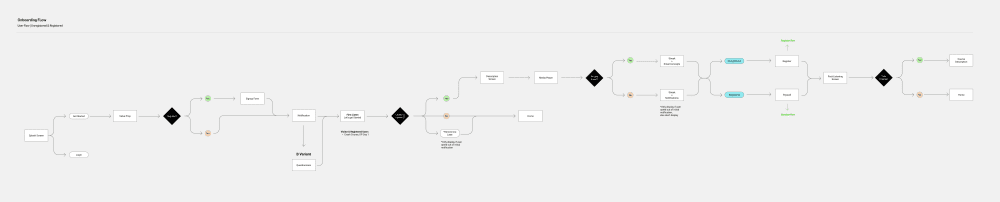
Onboarding Userflow
Onboarding
First up was the rethinking around the onboarding flow. Not only did we have to include the option for users to enter the app without registering, but we also had data informing us that users were more likely to stick around and convert to paying members once they engaged with their first listening experience.
Onboarding Designs
Onboarding
First up was the rethinking around the onboarding flow. Not only did we have to include the option for users to enter the app without registering, but we also had data informing us that users were more likely to stick around and convert to paying members once they engaged with their first listening experience.
Wayfinding
We started by pulling some data to analyze how users were moving through the courses, and it came to our surprise that not all users were moving in sequence; some were jumping from lesson to lesson in an ad hoc manner.
Having identified three different types of learning behavior helped us create the framework for an improved progress indicator.
- The Time Boxer
They like having a predefined structure, only interested in the 10 minute daily practice. - The Completist
Likes to complete everything, prefer to learn in a linear style. - The Browser
Prefer an overarching framework, they'll fill in that framework/goal in their own way. Appreciate lots of choice and the freedom to "jump" around.
Progress Cues
We started by pulling some data to analyze how users were moving through the courses and the data showed that the majority of users weren’t moving linearly throughout a course. Based on this data we were also able to identify which learning style corresponded to each behavior, based on the Meyer-Briggs personality type.
Coming up with three different types of user behavior helped us create the framework for an improved progress indicator.
We sought to implement these visual cues/progress indicators in three locations.
- Home
- Courses
- Post-Listening
Home
Home
Being the first screen you see whenever you open the app it provides a “wayfinding” tool to help users to instantly see their progress and streamline a user’s daily journey.
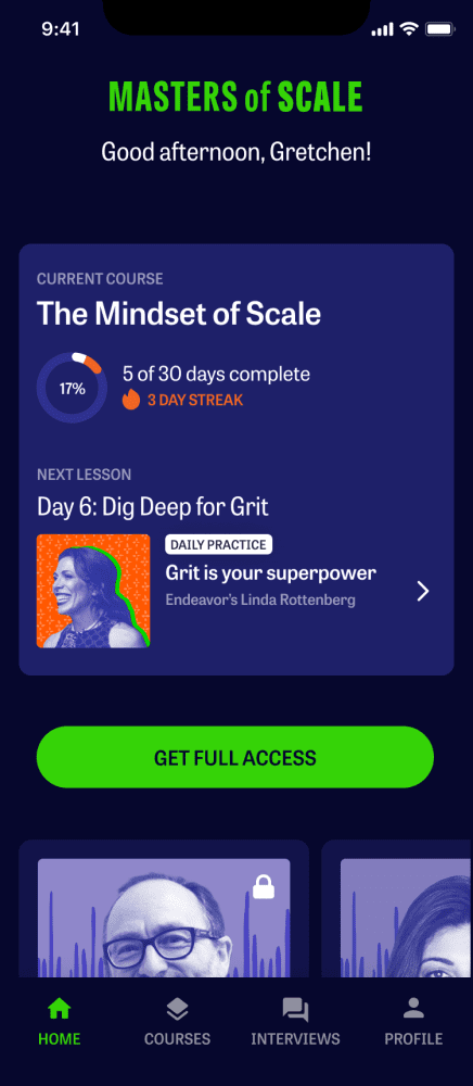
Issues
- Unable to directly access the course in progress.
- Cognitive overload with the “Current Course” meter.
- Lack of visibility into other content available.
- Discourages users from completing multiple units in a day, or move on to the next daily practice.
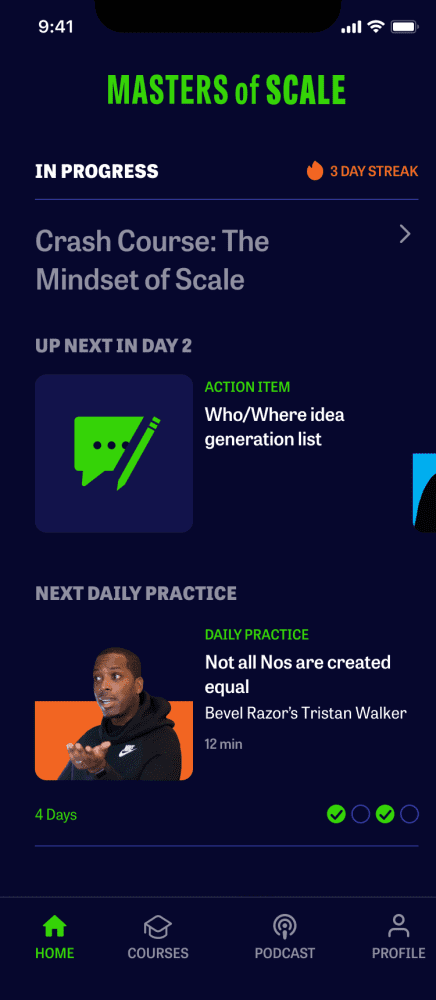
Solution
- Direct access to the course.
- Revealing all available content within a day/unit.
- Ability to skip ahead to the next Daily Practice.
- Clear visual indicator to show units in a course and their completion.
Courses
Courses
Keeping all relevant content contained within a visual hierarchical structure with visibility into the entire list of courses.
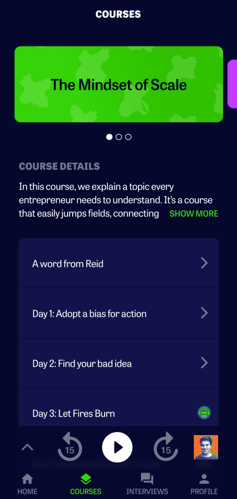
Issues
- Unexpected horizontal scrolling by way of a carousel.
- Dive two levels deep to access additional lessons.
Solution
- Common vertical scrolling with short descriptors for easy scannability.
- Visual indicators for the number of days within a course, as well as how many are complete.
Course Details
Course Details
At-a-glance look at a lesson’s state: incomplete, in-progress and complete.
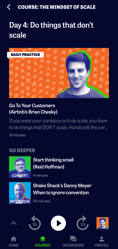
Issues
- Hidden lesson content.
- Easily forget placement.
- Unit/Day titles aren’t communicating the entrepreneurs that are within.
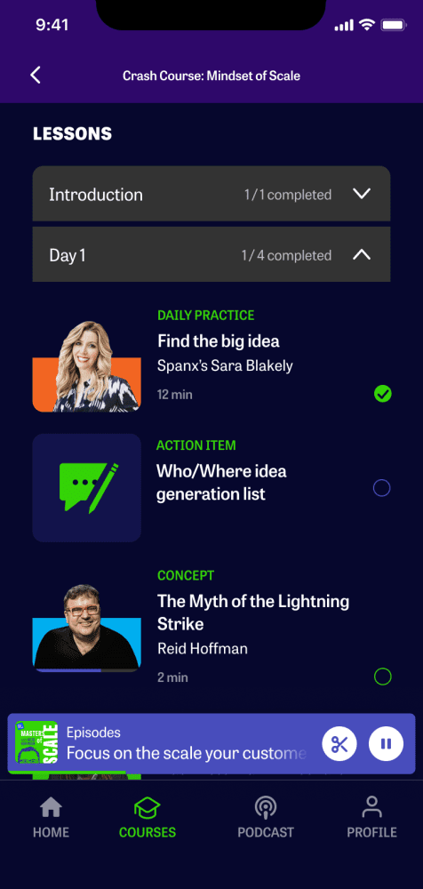
Solution
- Clear structure and every unit with its lessons laid out to view at-a-glance.
- Visual cues for incomplete, in progress and complete lessons.
Post Listening
Post Listening
The screen following the completion of a lesson. Providing this “wayfinding” tool yet again but in a contextual setting. Allowing users to continue on their journey by guiding them, but not being in their way.
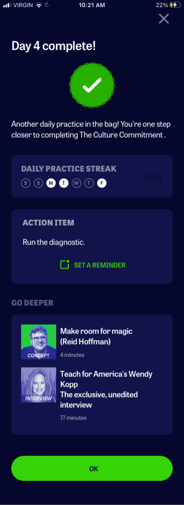
Issues
- Users felt they arrived at a dead end, and there was nowhere to go.
- Displaying too many options, with multiple paths.
- Unclear which path is the “correct” one to follow.
- Confusion as to what the CTA “OK” does/takes the user to.
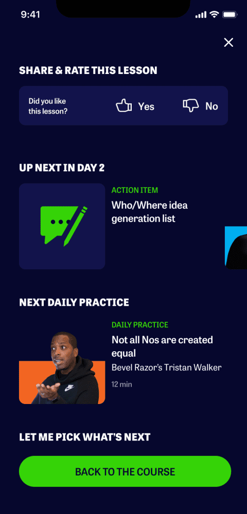
Solution
- Clear headline to indicate what’s up next.
- Again offering the opportunity to skip ahead to the next Daily Practice.
- Providing a path for those seeking to find their own content.
- Easily close and dismiss this screen, returning to the lesson.
- Opportunity to have users rate lessons listened to. Further aid in future customization.
Podcast
So how exactly was the podcast experience going to be presented? How were we going to seamlessly allow users to navigate from the podcast to the courses? And allow them to continue exploring similar topics?
Progress Cues
We started by pulling some data to analyze how users were moving through the courses and the data showed that the majority of users weren’t moving linearly throughout a course. Based on this data we were also able to identify which learning style corresponded to each behavior, based on the Meyer-Briggs personality type.
Coming up with three different types of user behavior helped us create the framework for an improved progress indicator.
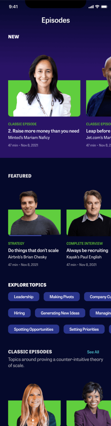
Podcast Screen
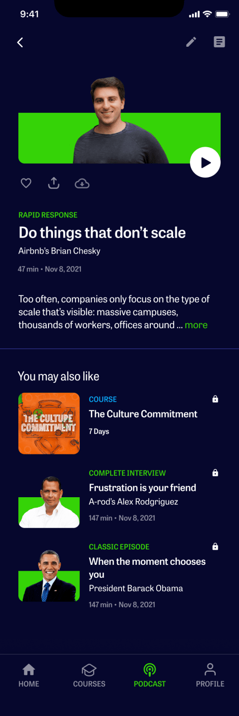
Episode Overview
For the podcast screen I explored multiple variations considering the different categories, topics and interests to allow listeners to find exactly what they were looking for, whether it was a new episode, a specific theme or an iconic business leader.
As users explored an episode they are able to view the related course alongside episodes that share a common theme. This helps increase engagement and eventually lead listeners into paying members.
Process
Wireframes → Mockups → Dev Handoff
Progress Cues
We started by pulling some data to analyze how users were moving through the courses and the data showed that the majority of users weren’t moving linearly throughout a course. Based on this data we were also able to identify which learning style corresponded to each behavior, based on the Meyer-Briggs personality type.
Coming up with three different types of user behavior helped us create the framework for an improved progress indicator.
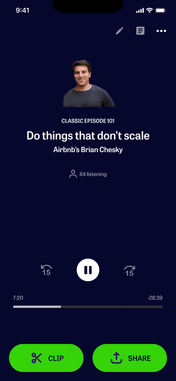
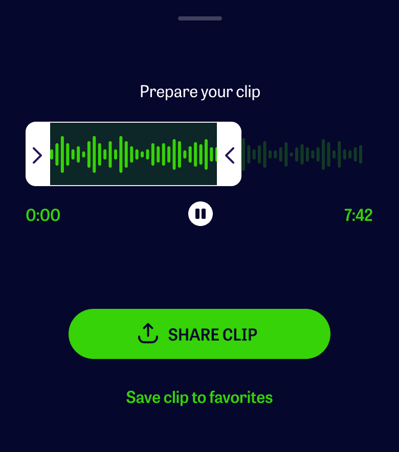
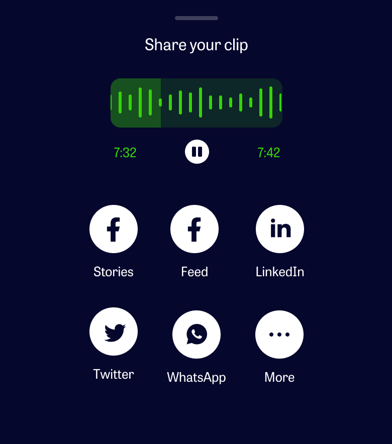
During the revamp, we saw an opportunity to extend engagement beyond the app by letting listeners share their favorite moments from an episode. Partnered with developers to understand technical constraints and with the product manager to align it with growth objectives.
Explored different UI patterns, e.g., waveform scrubbing vs. timestamp bookmarking and validated through internal testing.
Process
Research → Wireframes → User Testing → Mockups → User Testing → Dev Handoff
Results
First Listen Stats increased to 75%, an increase from an average of 48%.
Users reported improvement in navigating through a course and its lessons.
Delighted they can now consume the podcast and dive into courses all within the app.
Continue Exploring
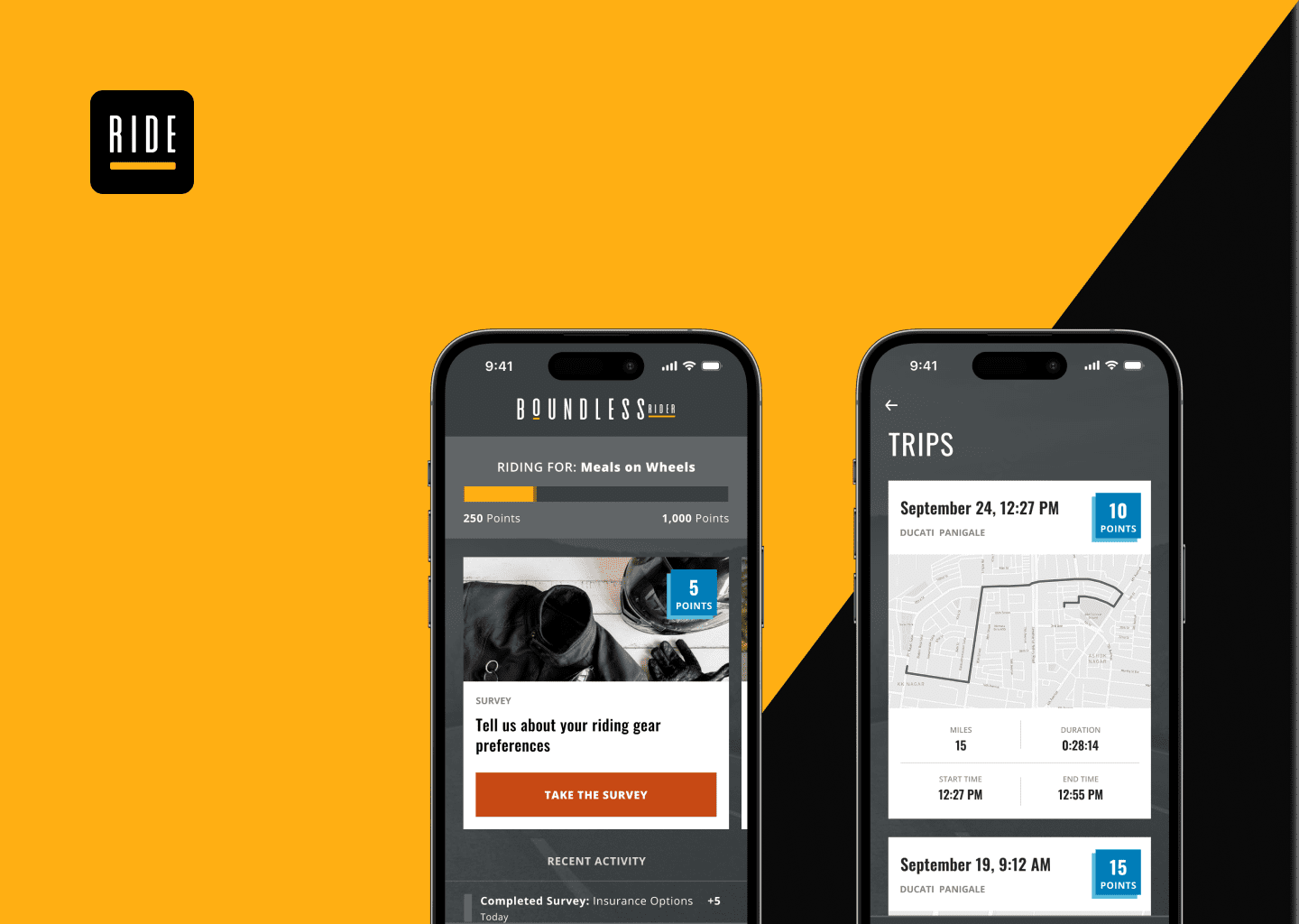
Boundless RiderInsurtech

CoFo DesigneCommerce
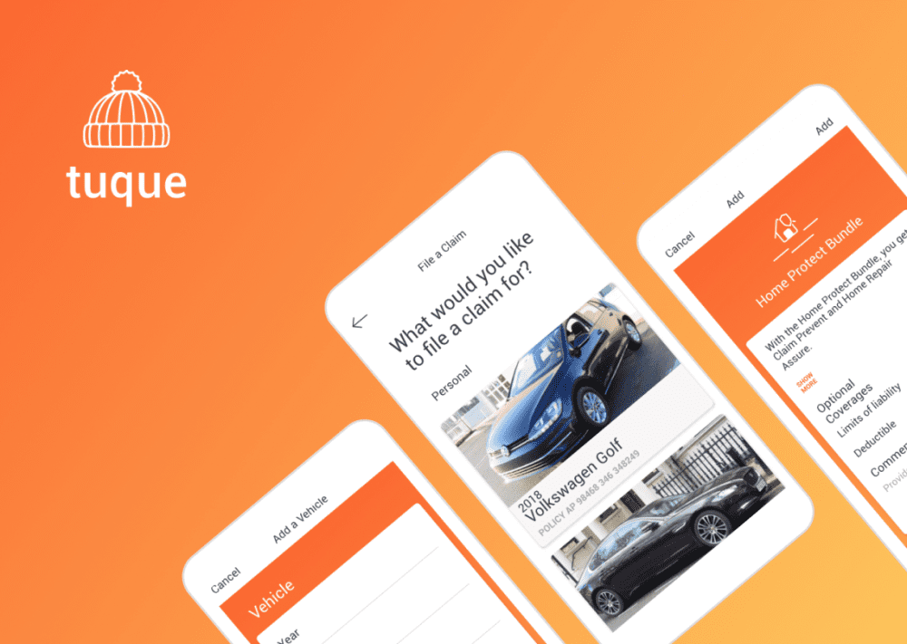
Tuque AppAuto Insurance

Sweet Reason - DrafteCommerce
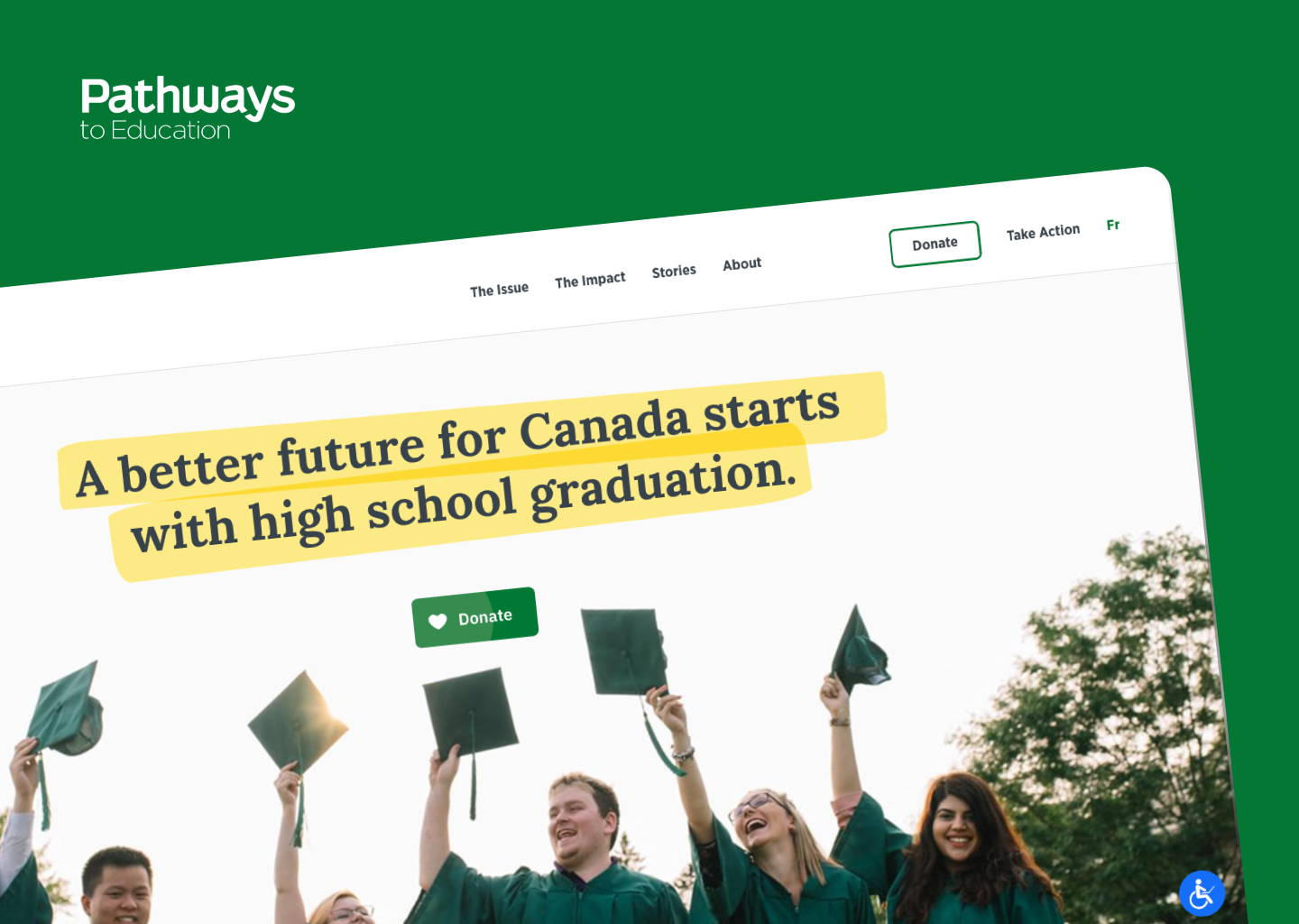
Pathways to EducationSocial Organization